_Side_09.png)
_Side_03.png)
_Side_05.jpg)
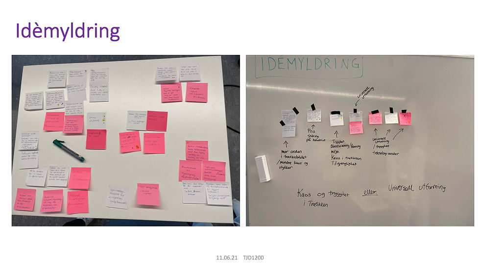
After a lot of efficient desktop research we ended up with 4 key insights. We then chose the most fitting HMW-questions and merged them into one which also became the base of our problem statement. We started brainstorming using different creative methods to go through all possible ideas to which direction to take this into.
_Side_11.png)

For our first concept we made a stop-motion film (that is unfortunately not longer possible to find) to visualize the automatic ramp that was the idea. Above you can see a behind the scene picture from the making of the stop-motion film. The idea was that an automatic ramp for all public transport would make it easier, more accessible and more comfortable for all users of public transport, and in this case especially for our persona who was a wheelchair user.
_Side_12.jpg)

_Side_10.png)
_Side_06.jpg)
We used Cards for Humanity as a tool to find our user and made a persona and status quo user journey based on this and our insights. We also decided on a problem statement to help us narrow our scope. Based on all this and our idiation session we ended up with three concepts.


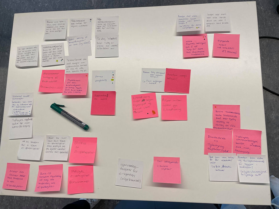
We had 24 hours for this exam - which meant we had to be efficient to get the result we wanted. We started by doing research and making a list of relevant "How might we?"-questions that we worked on to make one final HMW-question.
Process
The future of Ruter
When? 24 hours, spring 2021
What? This was a group exam in the subject prototyping and simulation. We were to create three concepts for better mobility in the city. We chose to focus on the age wave and how to improve Oslo's public transport for the older generation by using universal design that is necessary for some but good for all.
Who? This was a collaborative exam done by myself, Annecken Dahl, Kristine Tvedt Iversen, Åsne Kvisgaard and Aksel Grimstad.
_Side_08.png)
_Side_04.jpg)
Concept 1
Concept 2
_Side_14.png)
_Side_16.jpg)
The second concept was about clearer and better signage and directions for the users. We used bigger letters, clearer signs and easily accessible assistance by phone and the possibility of having signs read out load for you if you can't read.
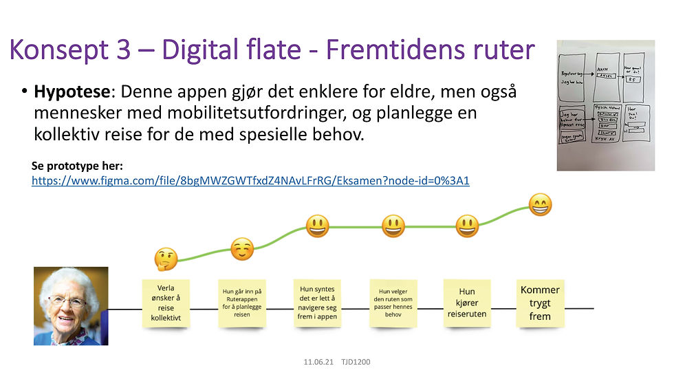
Concept 3
_Side_17.jpg)

For the third and final concept we made a figma prototype of a simplified and therefor more inclusive version of the Ruter app. We wanted the app to be easier to use for the older generation and also for people in general. We included both travel planner and payment in the same app, as well as the possibility to register any special needs on your user so the travel planner could be customized to your needs.